“A brand is a voice and a product is a souvenir.”
— Lisa Gansky
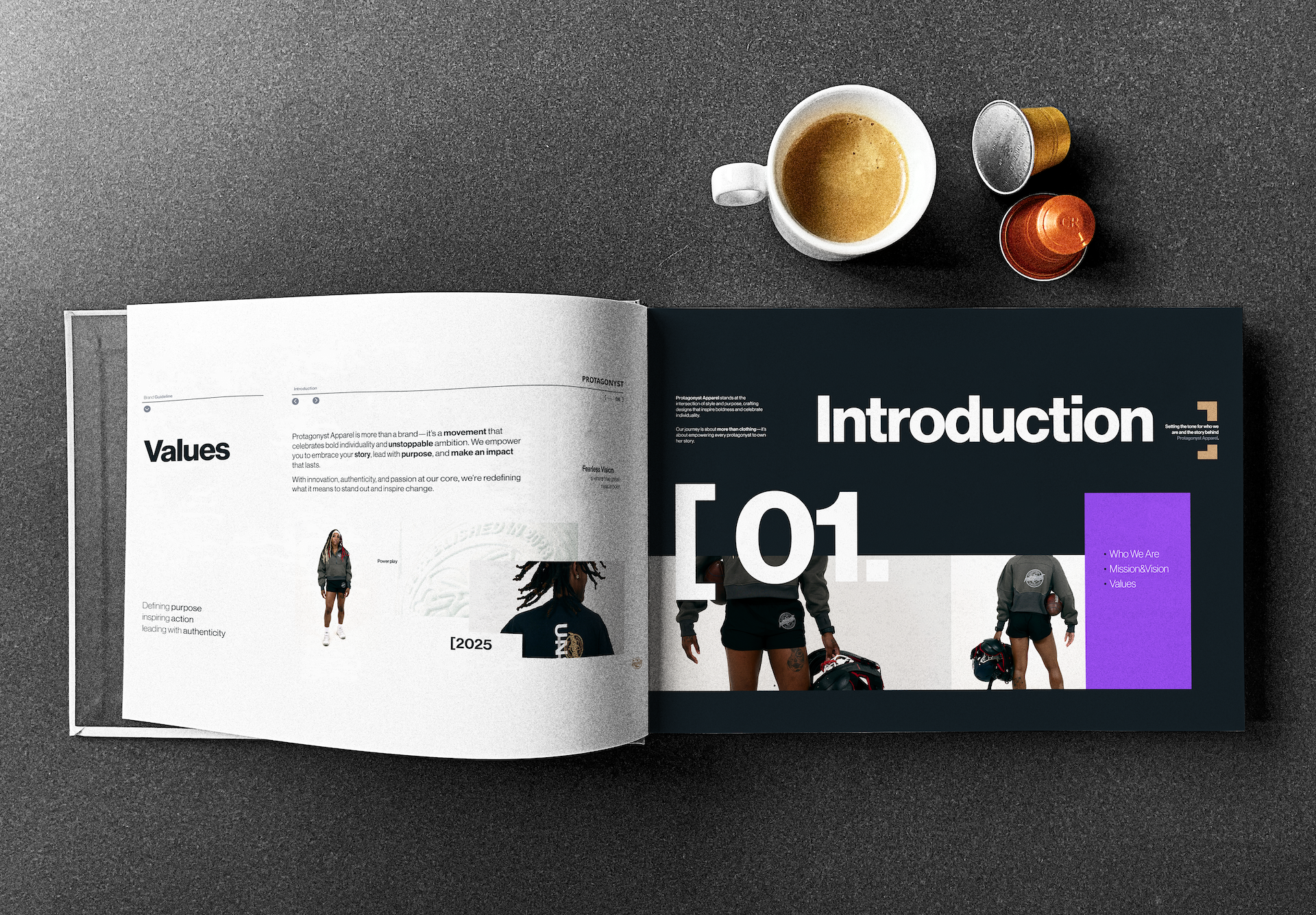
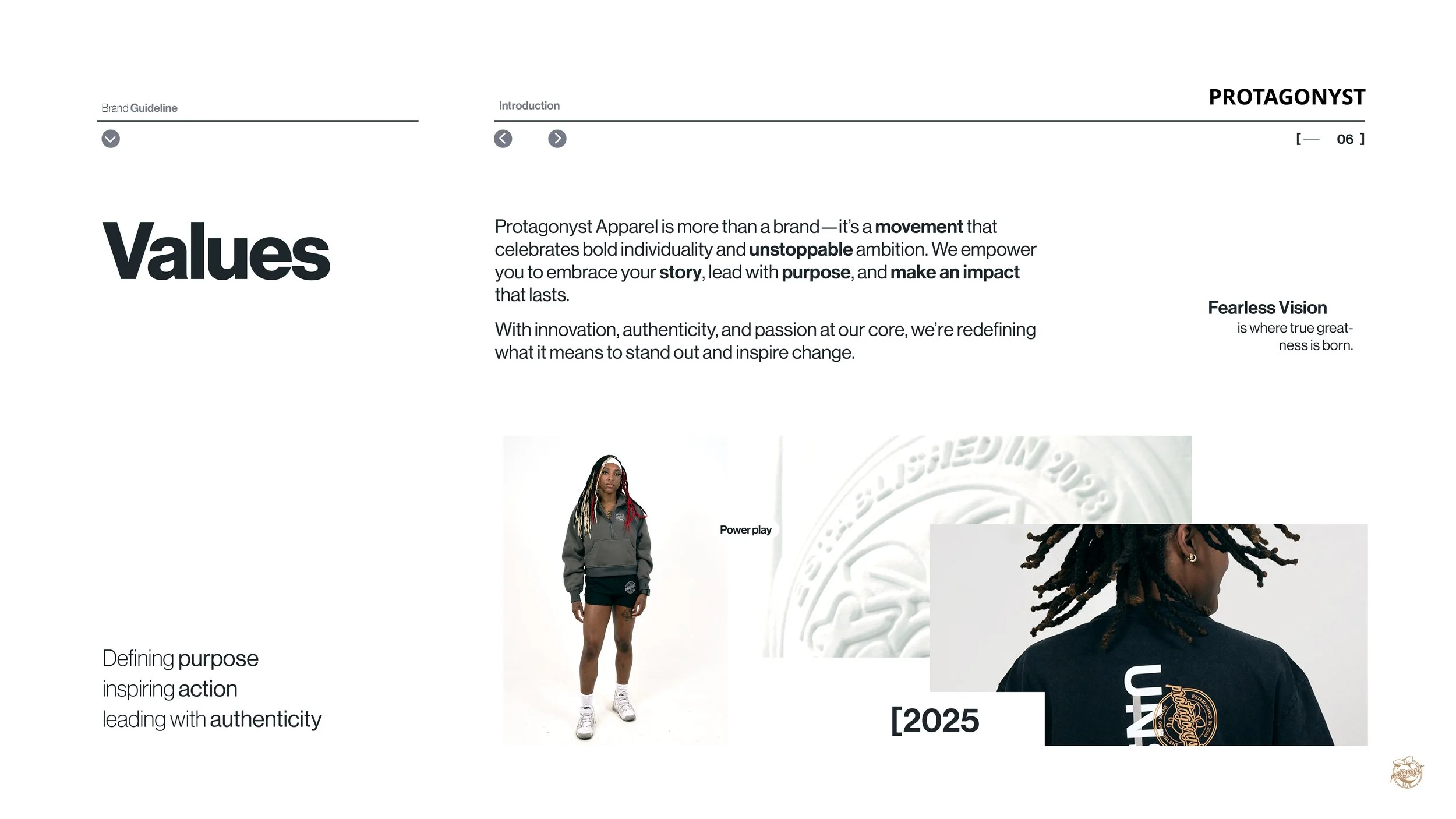
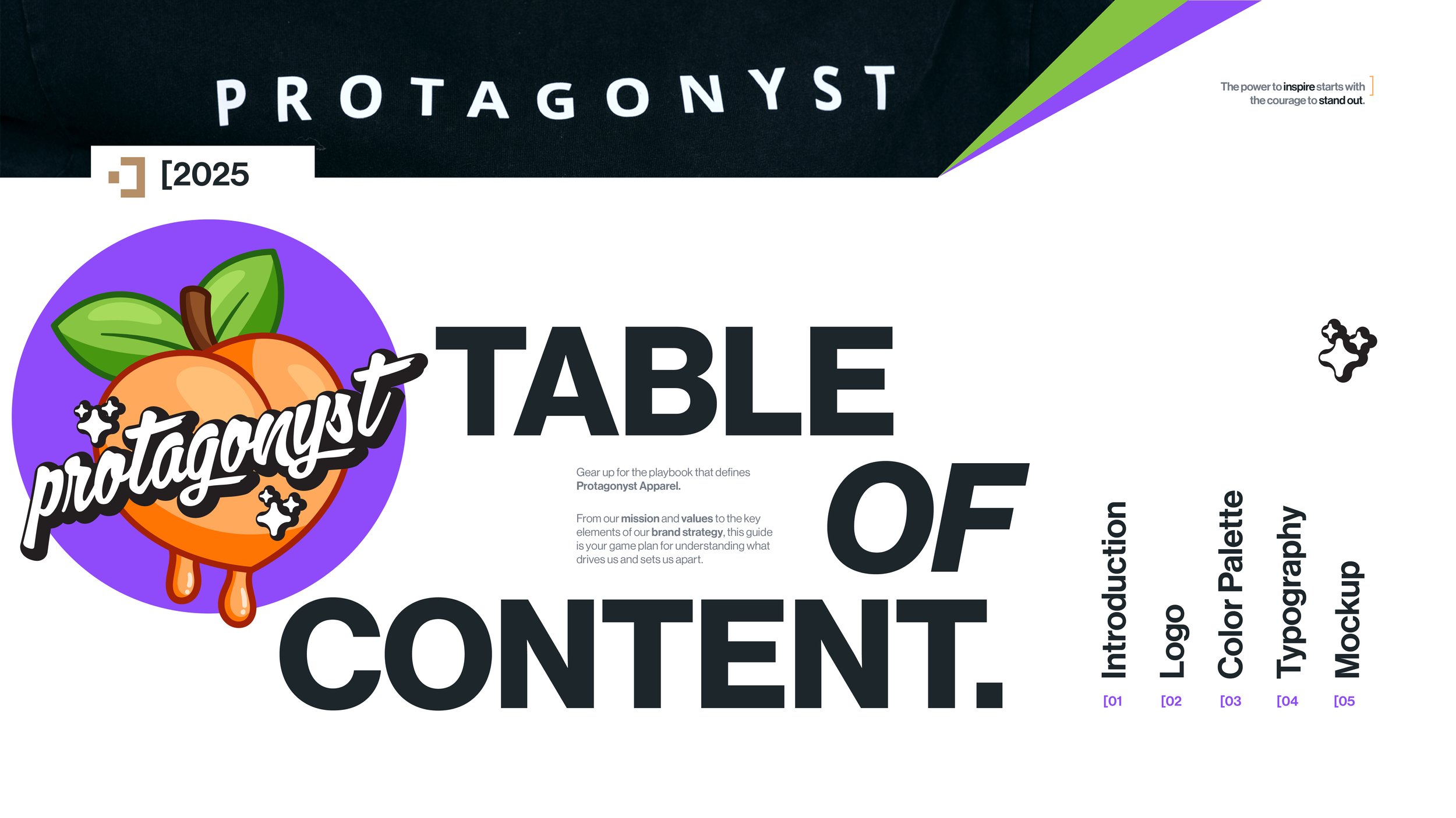
The Branding of Protagonyst Apparel:
Defining Identity Through Bold Branding
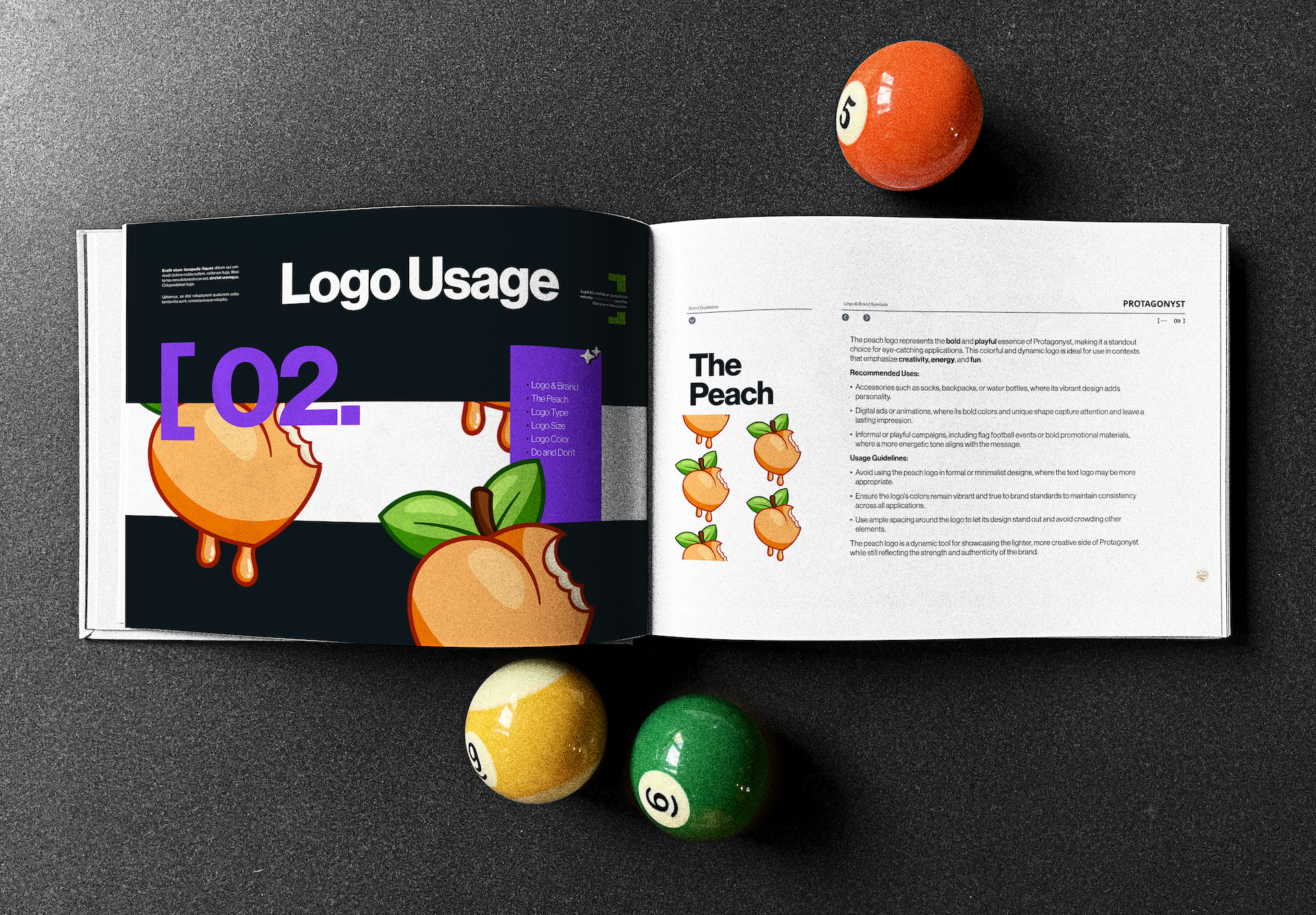
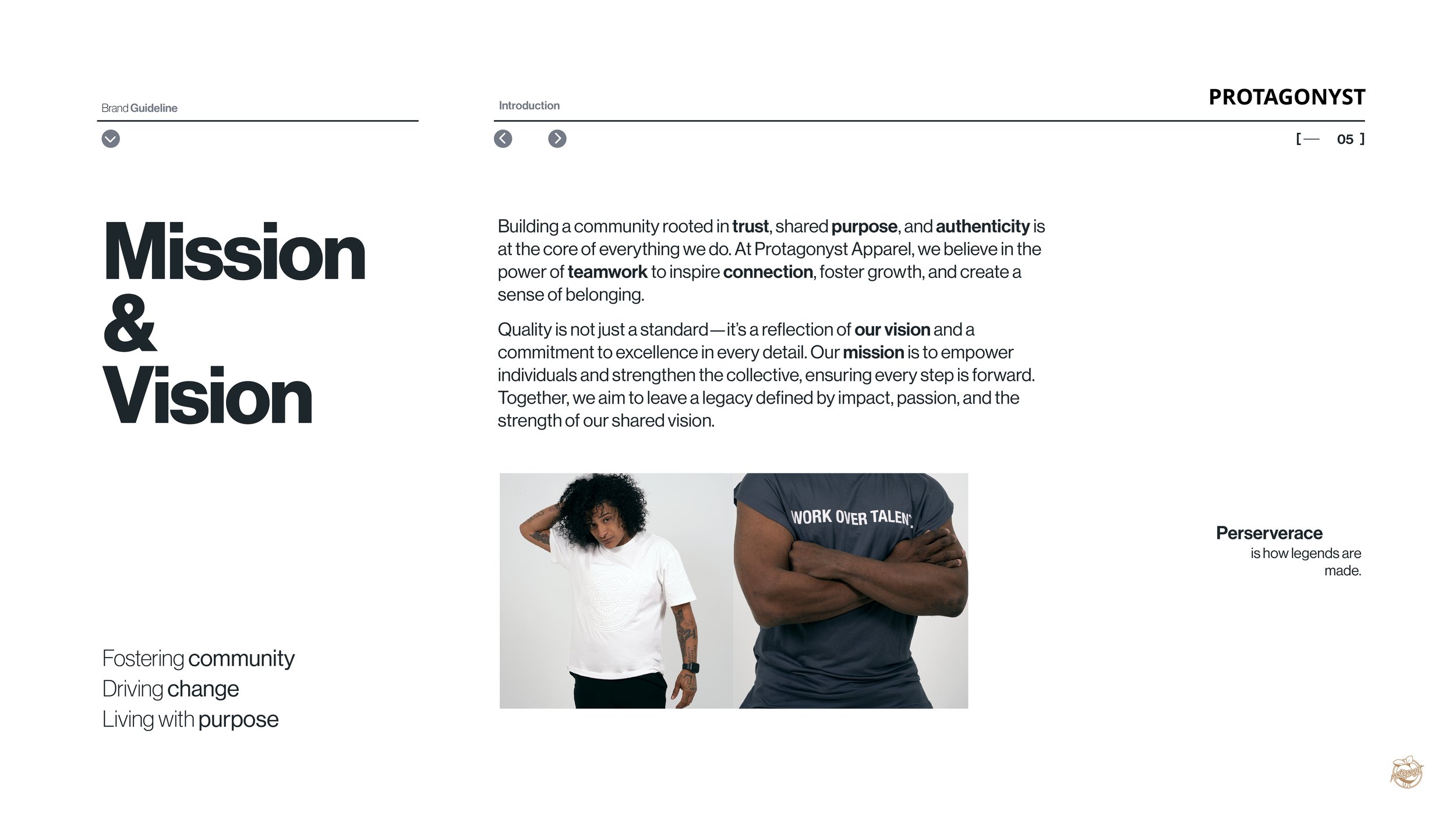
Protagonyst Apparel’s branding centers on the signature peach—a symbol of resilience, growth, and bold individuality. The logo blends organic elements with strong typography, balancing toughness and refinement. A peach-inspired color palette reinforces the brand’s mission: empowering individuals to own their journey, embrace evolution, and stand out with confidence. Every design choice reflects perseverance and self-expression.


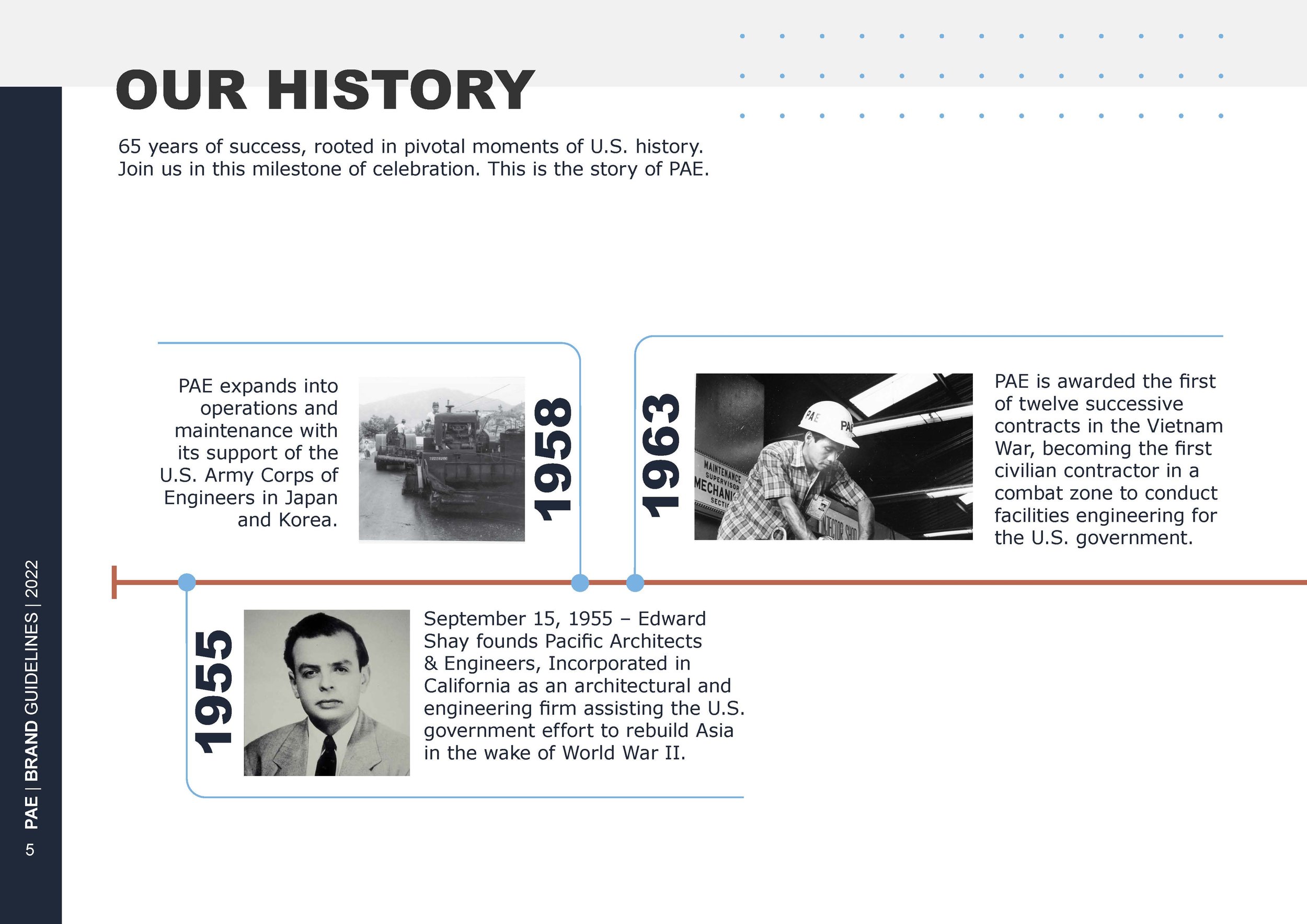
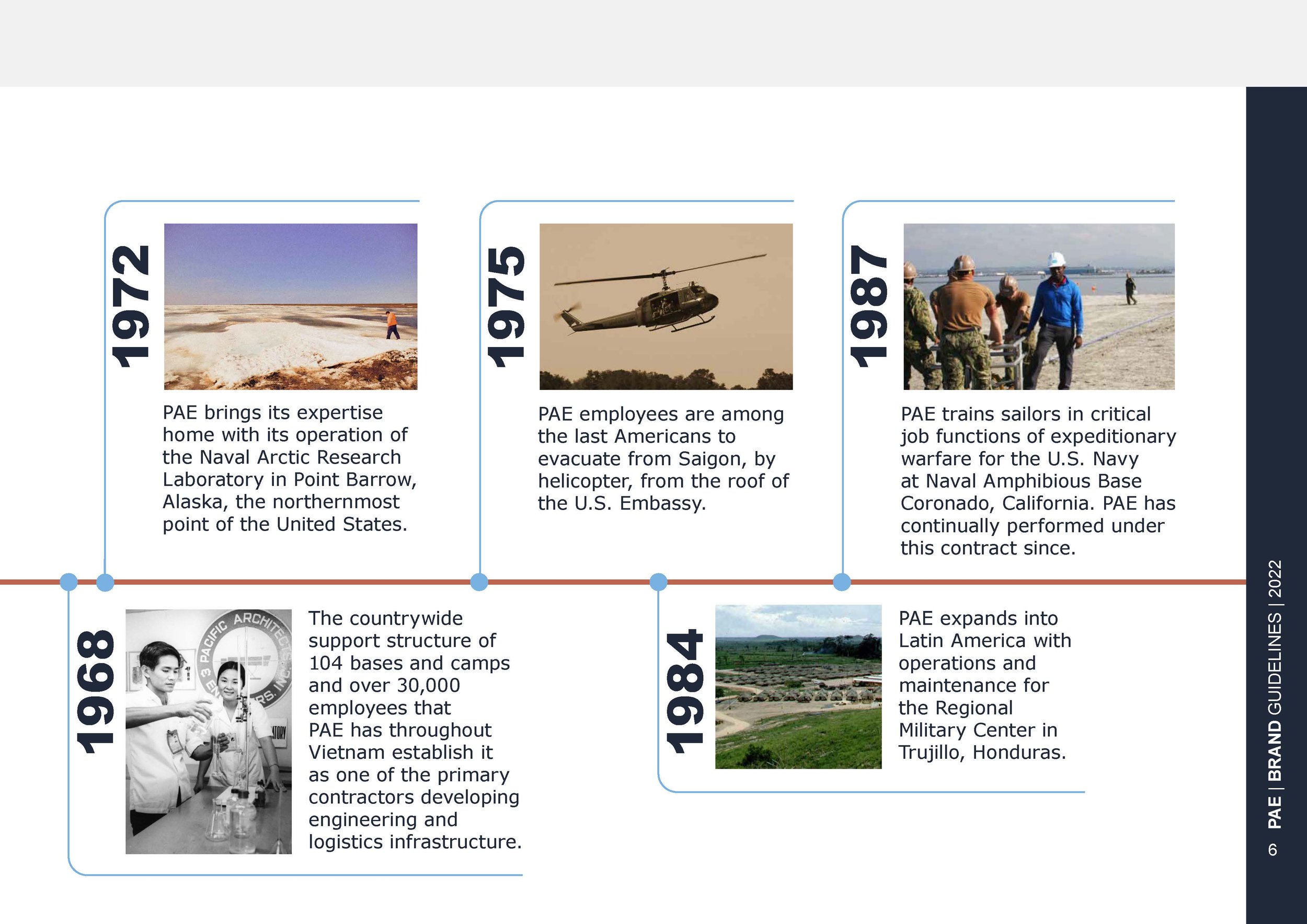
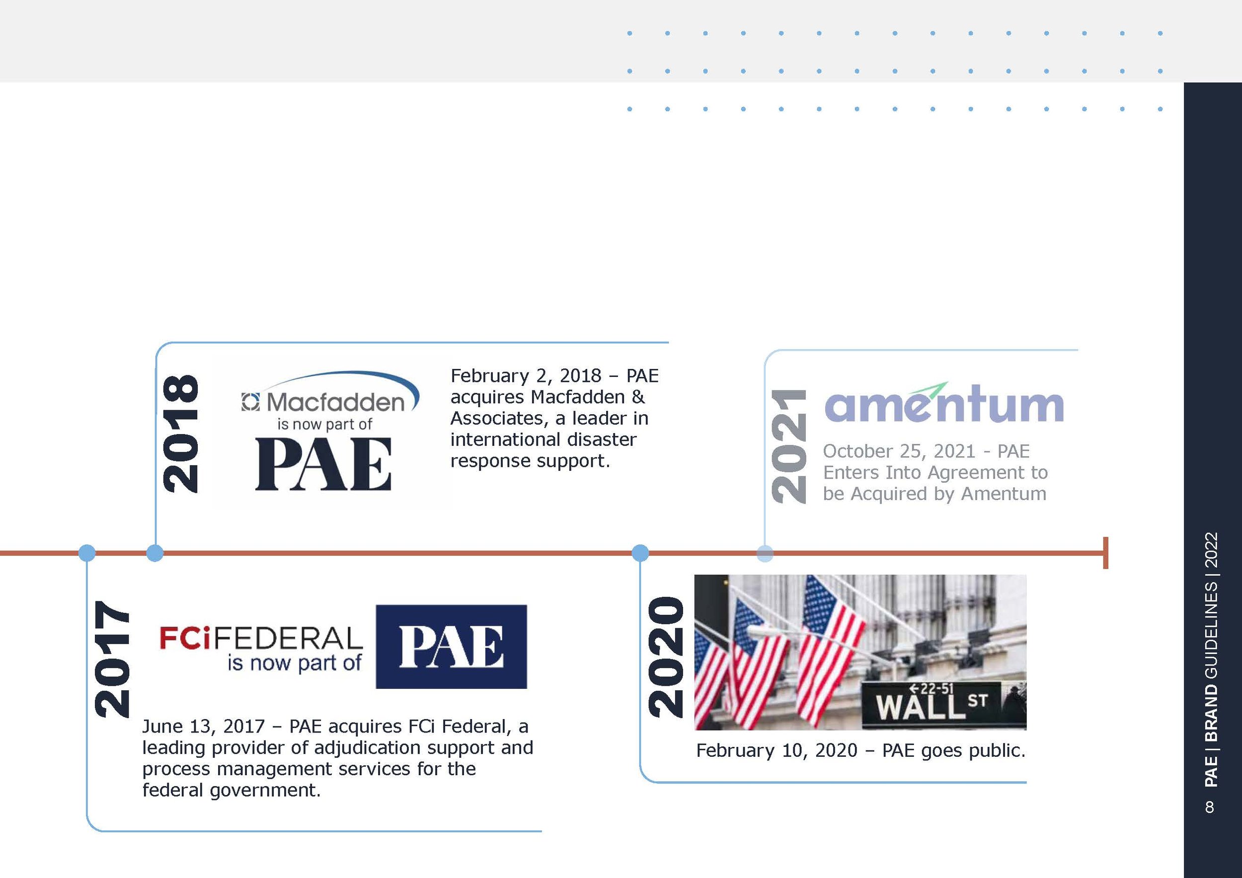
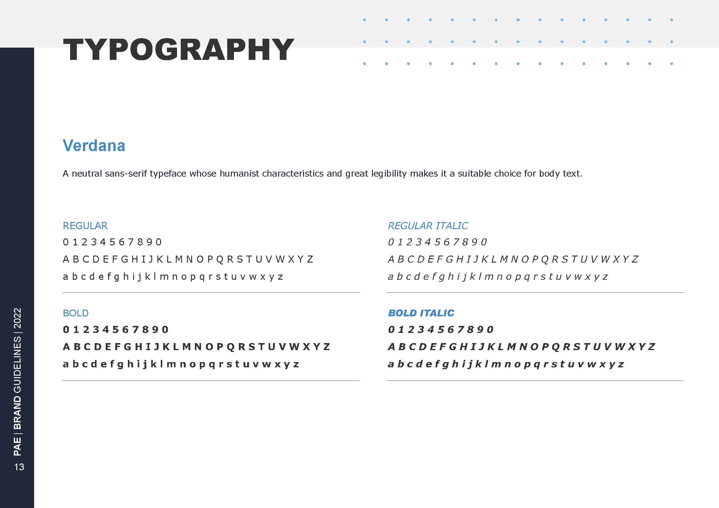
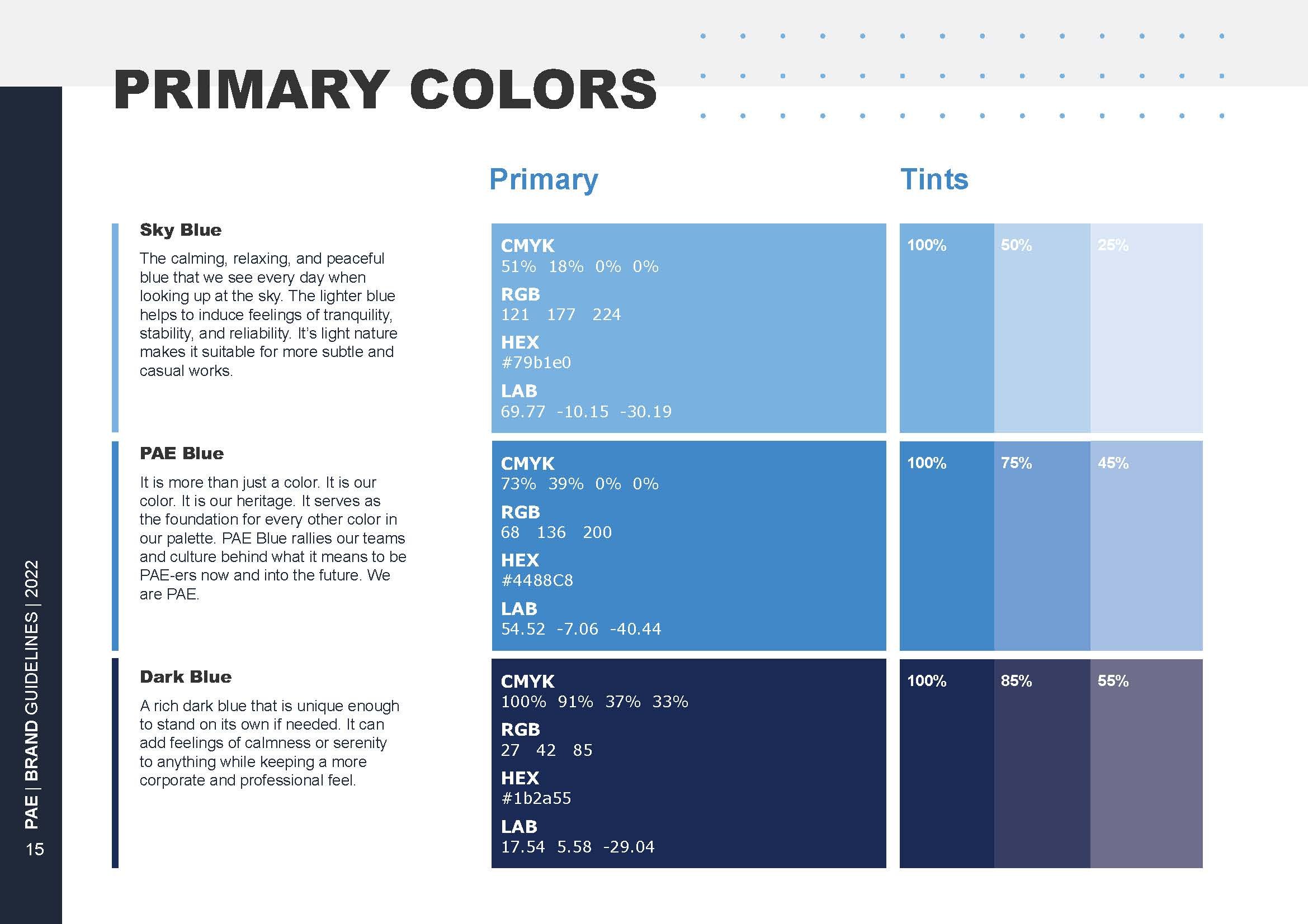
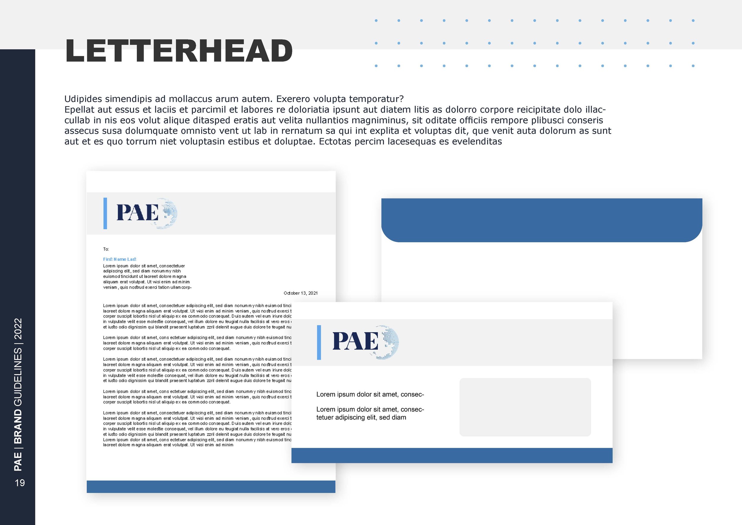
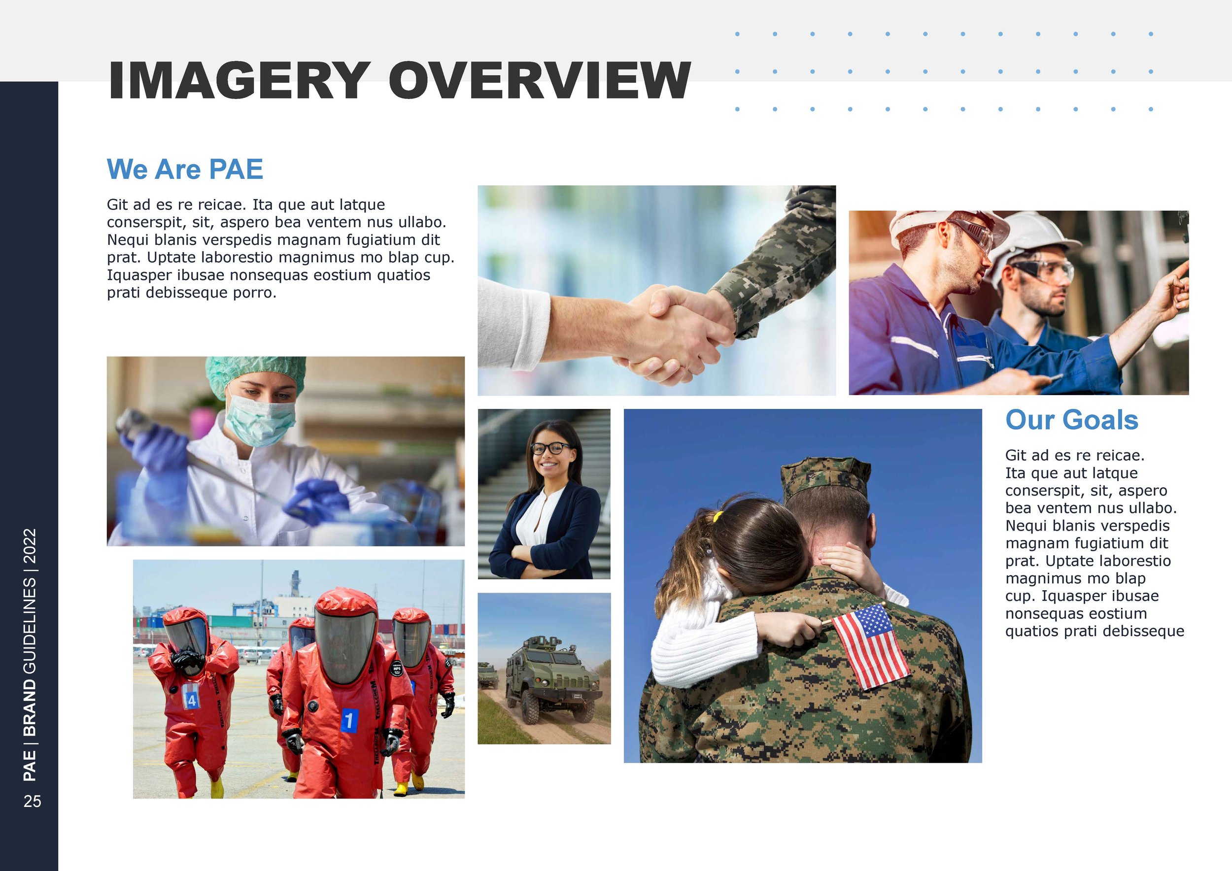
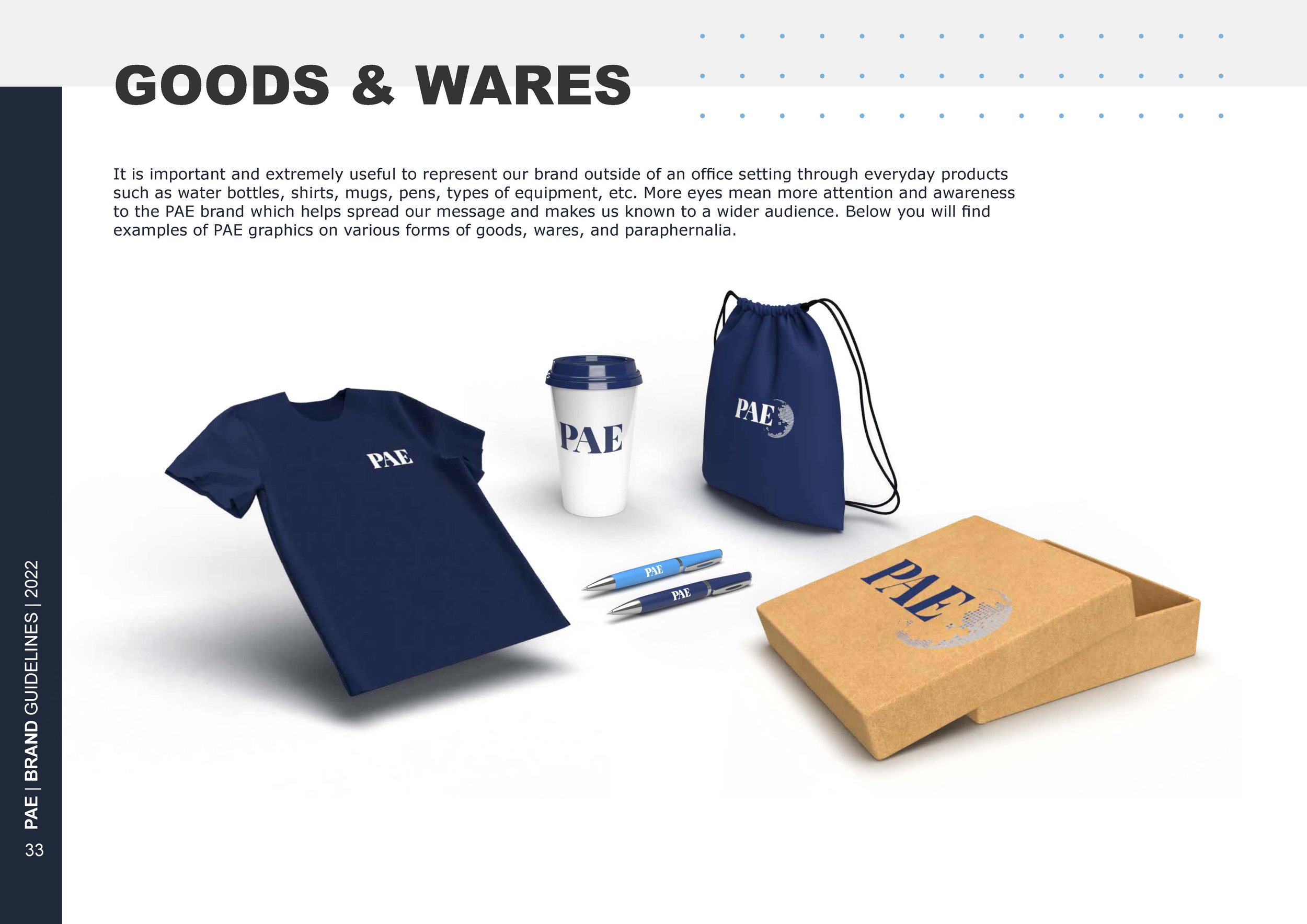
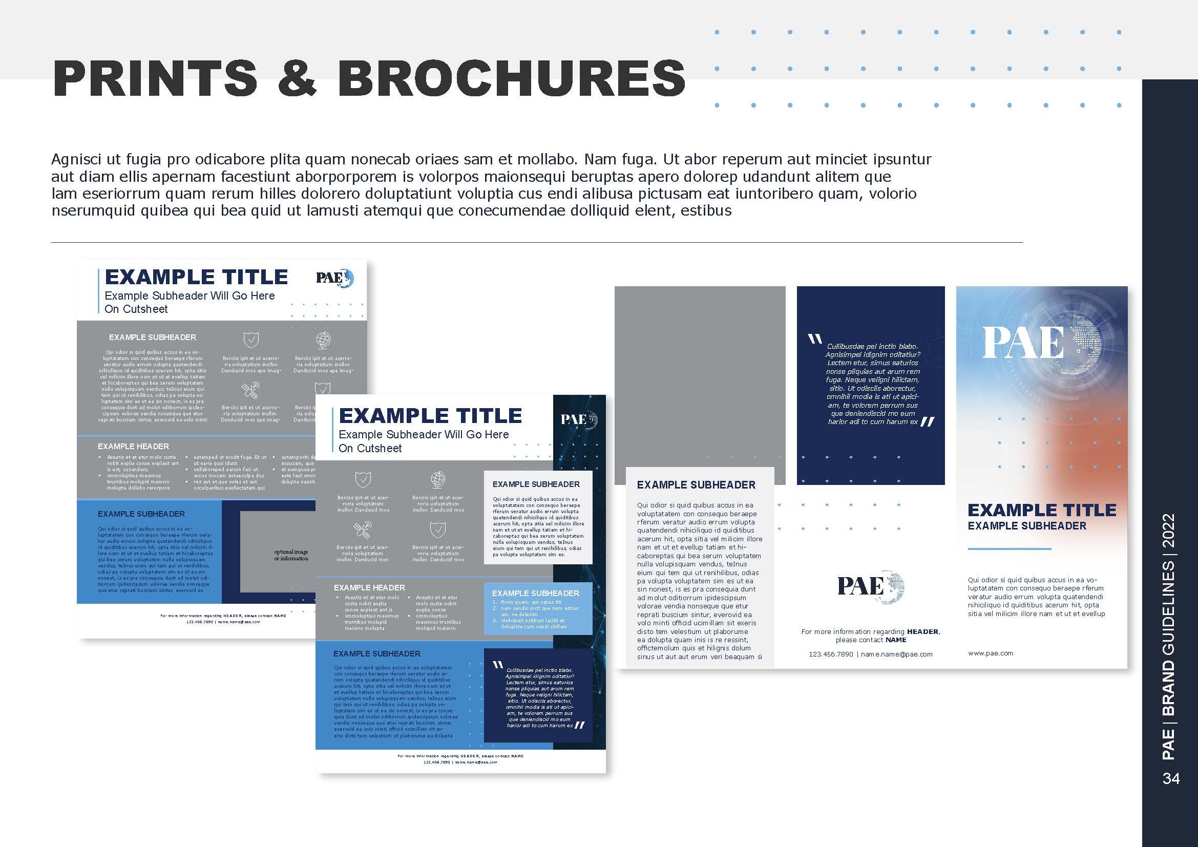
PAE Branding Guide Refresh: Humanizing Tech
The PAE branding refresh reimagines how tech companies are perceived, moving away from dark, rigid aesthetics to a more human-centric approach. A refined blue palette introduces clarity and trust, while modern typography and design elements reflect innovation without feeling cold. This shift positions PAE as a leader in AI and technology, balancing cutting-edge advancements with approachability and human connection.


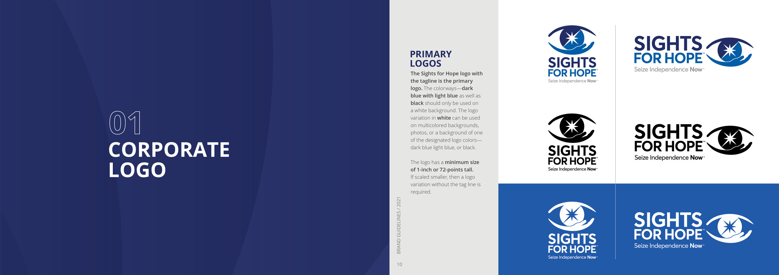
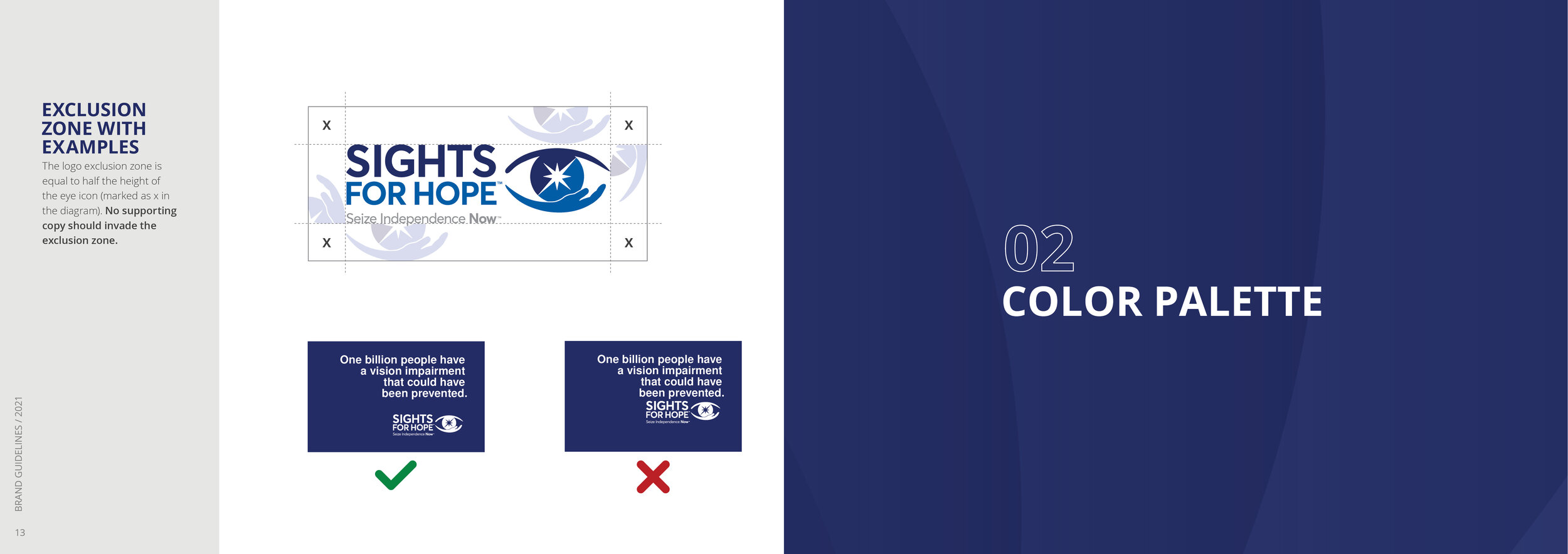
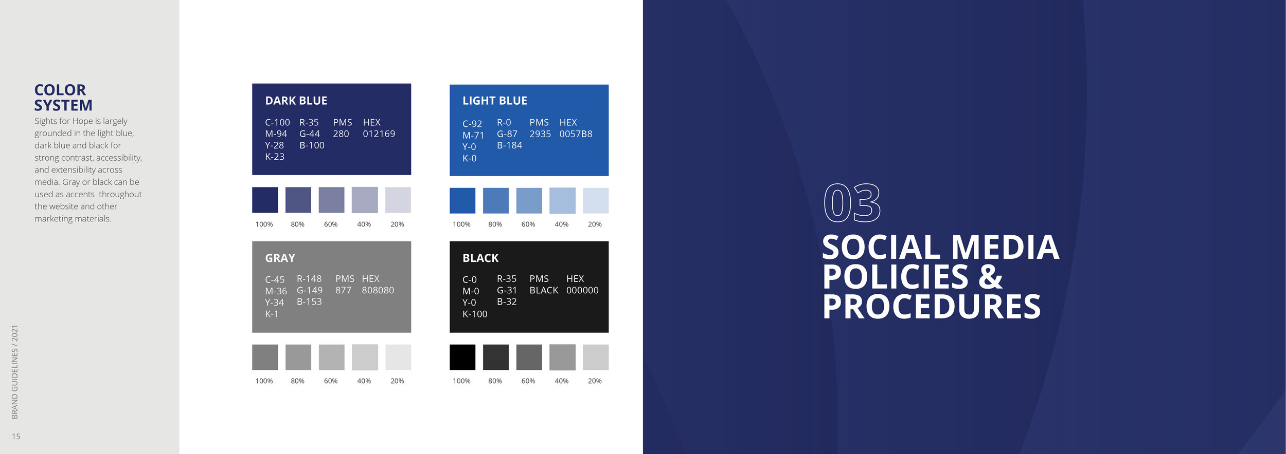
Sights for Hope: A Empowering Rebrand
The Sights for Hope rebrand redefined its identity with a focus on clarity, empowerment, and accessibility. The new design direction embraces a warm, inviting aesthetic that reflects the organization’s mission to support individuals with visual impairments. A refreshed color palette and modern typography enhance readability, while thoughtful design elements reinforce inclusivity and optimism. This transformation ensures Sights for Hope is both a guiding presence and a catalyst for independence.