Test the Prototype!
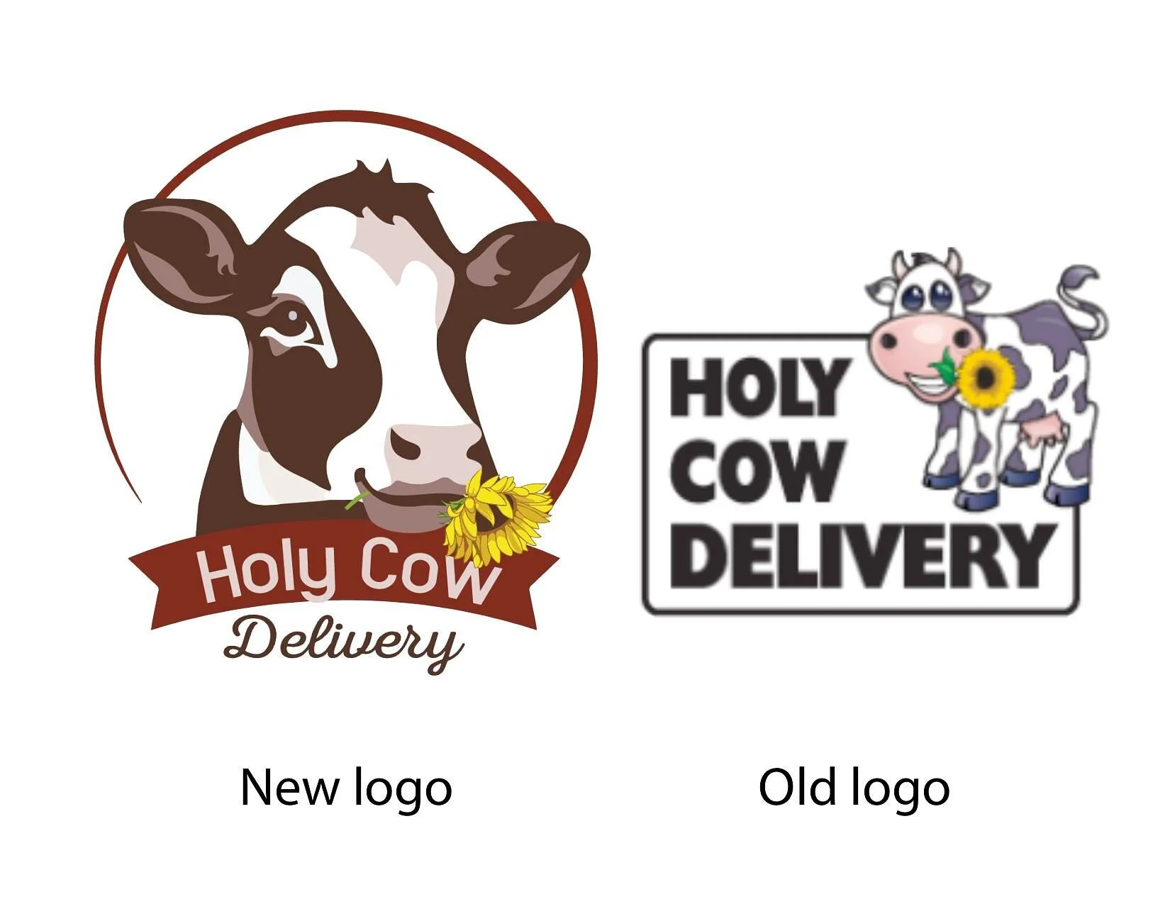
Logo Revamp
First, I remade the logo. I wanted to keep the idea of the cow and the sunflower but make it more professional and add a sense of maturity. I changed the color pallet and used the logo to color the website. I added a byzantine halo around the cow playing on the word 'Holy' to give it a flare of sophistication.

Byzantine halo example
I used this as an example of the type of subtle halo added to the logo.

The old home page
The old website was not responsive and not conducive to mobile application.

New home page
On the home page you can see the change of color scheme and the new font pairing suggests a professional creamery with a homemade/local feel. The photos added are professional caliber and add to the credibility of product quality.


